
This artist uses different shapes. They use the shape of the body to make a shadow. The shadow shows a sort of movement to me. The circles with the people in it are also shapes. The different shades of green in the back are made in shapes.
Line

The artist uses a good choice of lines in this design. The different types of lines shoes not movement, but a 3D type of element. There is a good contrast of lines. Some of the lines are easy on the eyes and others show a 3D feature.
Texture

This billboard shows texture. The words "fresh salad" show a lettuce-y type of texture. They also have the green, fresh type of look to it. It makes it look as if those salads really are fresh. The texture gives a good impression of the salad, and shows what its advertising.
Space
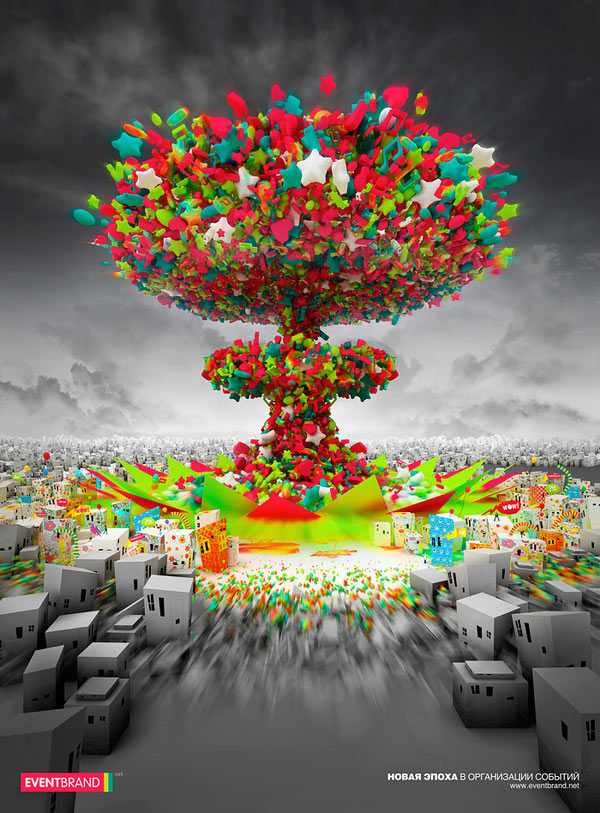
This artist uses a lot of space. The black and grey in the background really give the eye a rest. The middle design with all the stars and color use all the elements of design. There is a good usage of elements to plain here, and it really epitomizes the element of space.
Value

This artist uses value. In the background it is a lighter shade. In the design there are different shades of light to darker, and it contrasts against the words and the other parts of the poster.
No comments:
Post a Comment