Friday, October 14, 2011

Review Week 8

Why must designers pay close attention to how color is utilized within a composition?
because it impacts all of our visual communications. colors send the right tone and message and make sure you receive the right response. they create an emotional reaction.

Why is the color wheel an important tool for graphic designers?
first of all, it shows how you make certain colors and what colors are part of which. then it shows basic way thats colors are mixed, and which colors go together and the way they look good together. if you want to get a color scheme, and way colors look good together, then you can look at the color wheel and it will give you an idea of where to start and how to go from there.

Find an example of neutral colors utilized within a design (hint: google poster design). Near the sample, discuss why you feel the designer included neutral colors within the composition.
I think that the artist used these neutral colors of tones of brown so that the colors of yellow and blue and goldish would pop out. The neutral colors makes all the other colors show a lot more and makes the eye more attracted to them.
Briefly describe how we "see" the color of an object?
objects absorb or reflect the colors that are in the visible spectrum and the reflected colors are what we see.

Monday, October 3, 2011

Podcast #2 Color Theory


The right use of color can do what? maximize productivity, minimize visual fatigue, and relax the whole body.

Within the electromagnetic spectrum, which waves allow us to see color? visible light

Describe white light? equal parts of all color in the visible spectrum.

How do we see color if objects "have no color of their own"? objects appear to be in color when the absorb or reflect colors in the visible spectrum. reflected color is the color we see.

What is a glass prism? a transparent, triangular object that breaks white light into all the visible colors in the spectrum. all colors can be see when refracted through a glass prism.

What seven colors result when white light is refracted through a prism? red, orange, yellow, green, blue, indigo, and violet

Describe hue? hue is the color itself. each different hue is a different reflected wavelength of light.

When does white light occur? when all the wavelengths are reflected back to your eye.

When does black light occur? when no light is reflected back to your eye.

How color is perceived depends on what? the type of light that it is seen with, incandescent, fluorescent, or natural light. colors can change according to their surroundings.

What is a color wheel? shows different results of mixing colors

What are primary colors? Name them? red, yellow, blue. no colors can be mixed to make these colors. they are our 3 basic colors

What are secondary colors? Name them? orange, green, violet. 2 primary colors are mixed to make these.

What are tertiary colors? Name them? primary and secondary colors mixed together. red-orange, yellow-orange, yellow-green, blue-green, blue-biolet, and red-violet. primary color is named first

What are neutral colors? How can they be created? colors that dont show up on the color wheel. almost gray. very low saturations. blacks, grays, whites, and brown. complimentary color pair mixed.

How can a neutral color help a design? help put the focus on other colors or tone down colors that are emphasized on their own.

What are complementary colors? Name them? colors that are positioned opposite of each other. red and green, orange and blue, yellow and violet.

What is color value? the lightness or darkness of a color

What is a shade? adding black to a hue produces a low-value color

What is a tint? adding white to a hue produces a high-value color

What is saturation/intensity? the brightness of a color. full intensity when not mixed with black and white. you can change the intensity of a color by adding gray.

What happens when you mix complementary colors together? you produce a dull tone, when you put them side by side it increases the intensity

Describe color harmony? pleasing to the eye, engages the view, and a balance or order to the visual

What is a color scheme? harmonious color combinations. colors that are used to create style and appeal. based on the color wheel and the arrangement of color.

Describe a monochromatic color scheme? uses variations of tints or shades of one color. clean and elegant. go well together for a soothing affect. very easy on the eyes

Describe an analogous color scheme? 3 colors that are adjacent to each other on the color wheel. one color is dominant and the other two enrich the scheme. often found in nature and pleasing to the eye. bright and cheery effect. can accommodate changing moods.

Describe a complementary color scheme? two colors that are opposite of each other the color wheel. draws a lot of attention, high contrast composition. seen in nature.

Describe a split-complementary color scheme? uses a color and its 2 colors adjacent to its complimentary color. will draw attention, but without the tension of a complimentary color scheme.

Describe a triadic color scheme? 3 colors equally spaced around the color wheel. strong visual balance

What colors are considered to be warm colors? yellows, oranges, and reds

Describe a warm color scheme? bold and energetic. appear closer, so do not overwhelm. needs to pop out, consider using warm colors in the design.

What colors are considered to be cool colors? greens, blues, and violets.

Describe a cool color scheme? an impression of calm, rarely overpowers the main concept, appear farther away. give an allusion of depth

Why is important to consider which colors are being used within a design? impacts all of our visual communications. the right tone and message. the right response. creates an emotional reaction.

Friday, September 23, 2011

Review Week 6

What is the pen tool used for?
It is used to draw organic shapes that can not be made with the shape tool. You can use it to trace a picture.

How can you manipulate a path/line in Illustrator? Discuss the use of the white arrow tool, pen+, pen-, and convert too.
The white arrow tool is used to manipulate the curves. The pen+ tool can add a new point so that you can make a curve smoother. The pen- tool deletes a point on the line, and the convert tool turns a curve into a pointy edge.

How can you utilize the layers palette in Illustrator?
You can use them to lock the layer beneath and then trace over it on a new layer to make a new image. Then you can hide the layer below with the original picture on it, and then it only shows your design.

How do you create a clipping mask in Adobe Illustrator?
First you make a rectangle with no fill or outline outside of the image. Then you go to object, bring to front. Then you click the black arrow tool and select all of the image. Then you go to object: clipping mask: make. And it should be made!

Thursday, September 15, 2011

Review Week 5

Shape
This artist uses different shapes. They use the shape of the body to make a shadow. The shadow shows a sort of movement to me. The circles with the people in it are also shapes. The different shades of green in the back are made in shapes.


Line
The artist uses a good choice of lines in this design. The different types of lines shoes not movement, but a 3D type of element. There is a good contrast of lines. Some of the lines are easy on the eyes and others show a 3D feature.


Texture
This billboard shows texture. The words "fresh salad" show a lettuce-y type of texture. They also have the green, fresh type of look to it. It makes it look as if those salads really are fresh. The texture gives a good impression of the salad, and shows what its advertising. 


Space

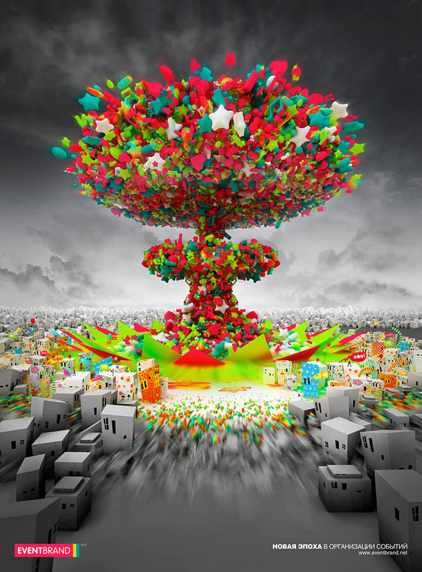
This artist uses a lot of space. The black and grey in the background really give the eye a rest. The middle design with all the stars and color use all the elements of design. There is a good usage of elements to plain here, and it really epitomizes the element of space. 


Value
This artist uses value. In the background it is a lighter shade. In the design there are different shades of light to darker, and it contrasts against the words and the other parts of the poster. 

Friday, September 9, 2011

Review Week 4

Why/how can icons be used to communicate?
Icons are used to communicate so that people can quickly look at a picture and understand what it is telling them to do or what it means. People know what the icons mean by just means of past experience and understanding what it means. Icons are used to communicate different road conditions, turns, where to go, what is approaching (food, gas, etc), and many more things!


What is the difference between copyright and public domain?
Copyright means that one author has the authority to say who uses their art, and where it goes. If someone else uses their art, then they have to properly state where they got it from. Art that is public domain is usually copyrighted work that has an expired copyright. Public domain means that anybody is allowed to use whatever this artwork is.

How can you avoid plagiarism in this class? In other classes?
In this class, you can avoid it by not looking up on the internet what you are supposed to be doing. The idea will always be stuck in your head and you will forever work off of that. You should just concentrate on what YOU think of when you get an assignment, and work off of your own ideas. In other classes, you should just do your own work and not look up the answers for whatever you are doing. Do not copy other peoples' work!

Friday, September 2, 2011

Review Week 3

What is OSHA? What do the letters stand for?
OSHA stands for Occupational Safety and Health Administration. It will help you create a safe and comfortable computer working environment. There are basics to look at when performing computer related tasks.


How can graphic designers effectively communicate? In your own words, explain the communication process.
They can communicate through visuals and graphics. First they have to figure out what their message is, and how they are going to say it. They need to figure out how they are going to use the visuals (texts and images) together, and make sure they all actually work together.


Understanding the history, culture and movements of fine and graphic arts will make you a better producer of visual messages. Why?
It will help you because you will know how to use all the different types of art graphically and how certain things will come off as, and how they will be perceived. They can be used to see how things in the past were produced and what their message was.

Podcast #1 Elements of Design


What does it take to create good graphic design? Understanding of elements and design principles.


What is the difference between elements and principles elements components or parts, the things we add to a design. Principles are what tell us how to organize the elements on the page or sceren.

Name the six (6) elements of design. Line, shape, space, texture, value, color


What can lines aid in, when alone or combined with  other lines or shapes? Specific meaning, aid of readability, and message of a desgin


Which lines suggest a feeling of rest? Why do you think? Bv they are flat and look like they are laying down or staying still


Vertical lines communicate a feeling of what? Why do you think? Liftiness because they are going up and down. They make you feel short


What lines suggest a feeling of movement? Why do you think? Diagonal lines. They are unstable in gravity and you ale your eyes to move to see them


Soft, shallow curved lines suggest what? Why do you think? Comfort safety relaxation they go easy on the eyes


These lines suggest confusion and turbulence? Why do you think? Sharp deep lines


What element defines a specific area of space? shapes


What is the difference between two dimensional shapes and three dimensional shapes? Width and height = 2D depth with height = 3D


Describe the difference between geometric shapes and organic shapes? Geometric is structure and cemtrical ex. Squares, circles, triangles. And natural/organic are found in nature irregular.. ex. leaves


What are abstract shapes? Stylized versions of natural/organic shapes ex. Handicap sign


Which basic shape projects an attitude of honesty or equality? Square- honesty/equality


What do triangles suggest? Action or stability


Circles convey feelings of what? Feeling of protection of infinity


Describe positive space and negative space?
positive- objects and elements used in design contains all elements
Negative- shapes around or between elements gives eye a place to rest


What is texture? Actual surface of a design, can feel the design, or implied texture


Incorporating texture into a design can help do what? Help create a feeling of richness and depth


What is value? Degree of light and dark in a design contrast of white and black


What is another name for value? tone


What can the element of color do when incorporated into a design? Convey moods, create images, attract attention, identify objects